eeBoo Piece & Love
27 year old games and gift brand eeBoo were in need of a logo solution for their parent and sister brand (Piece & Love) to sit together in harmony.
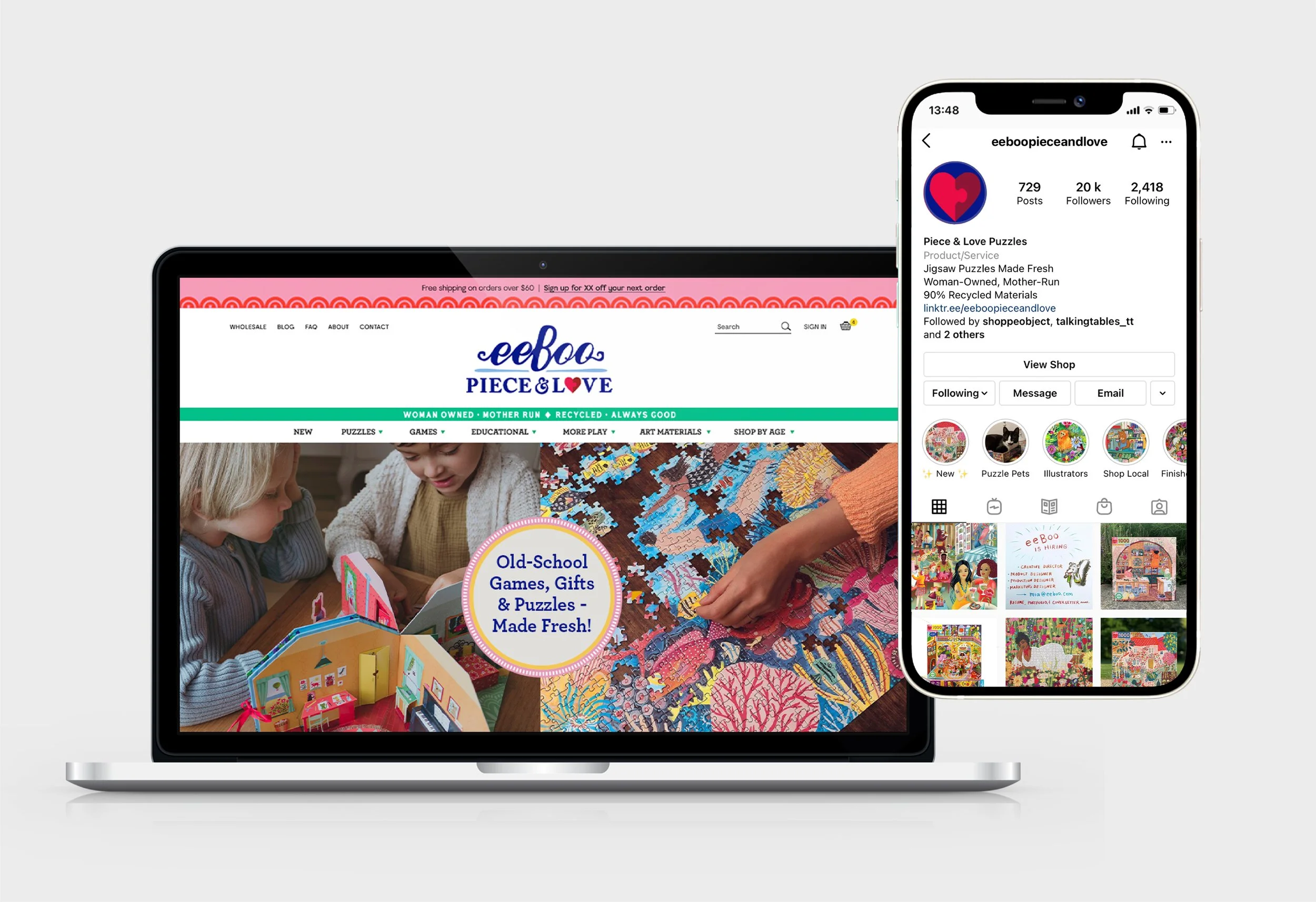
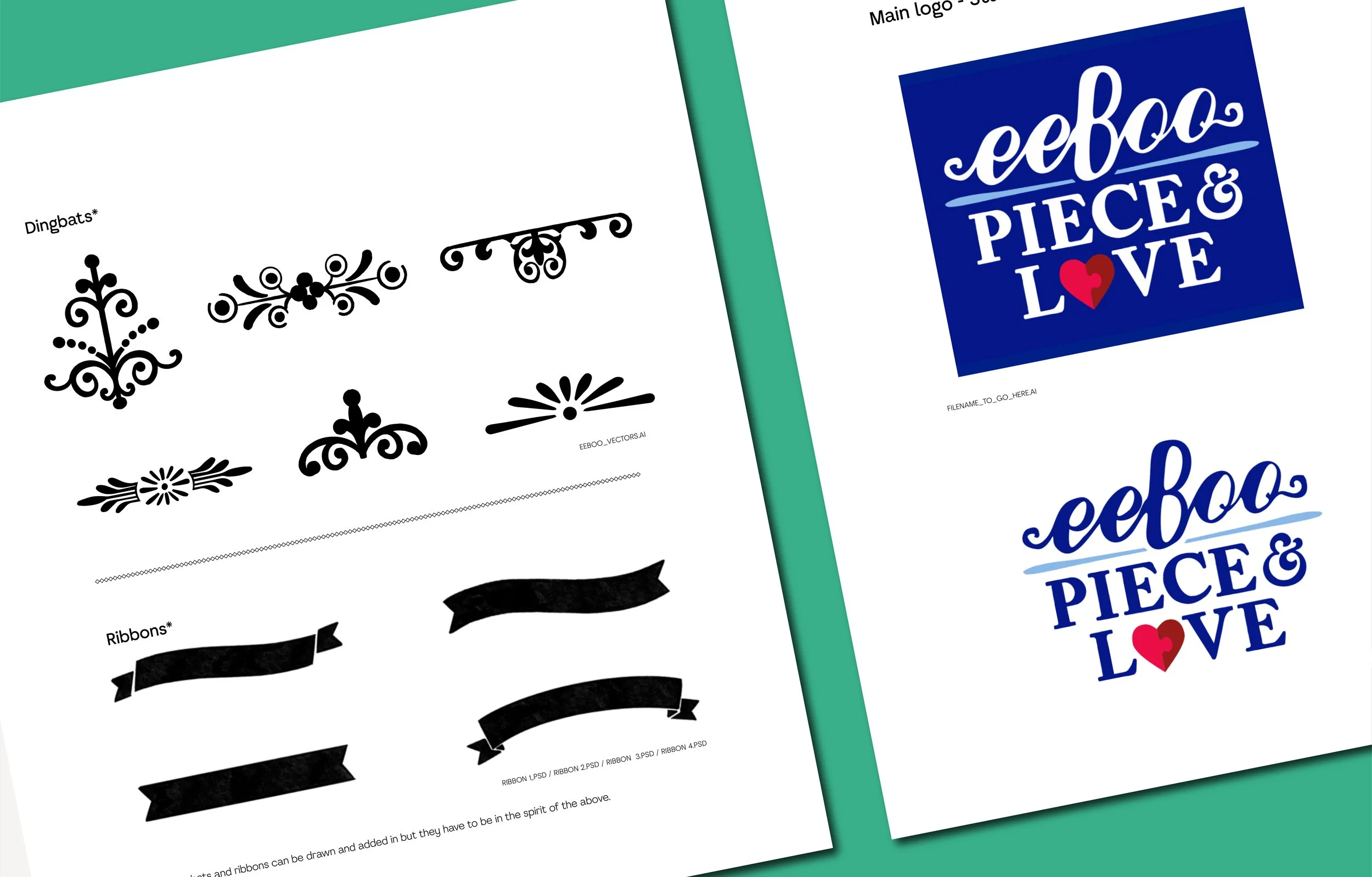
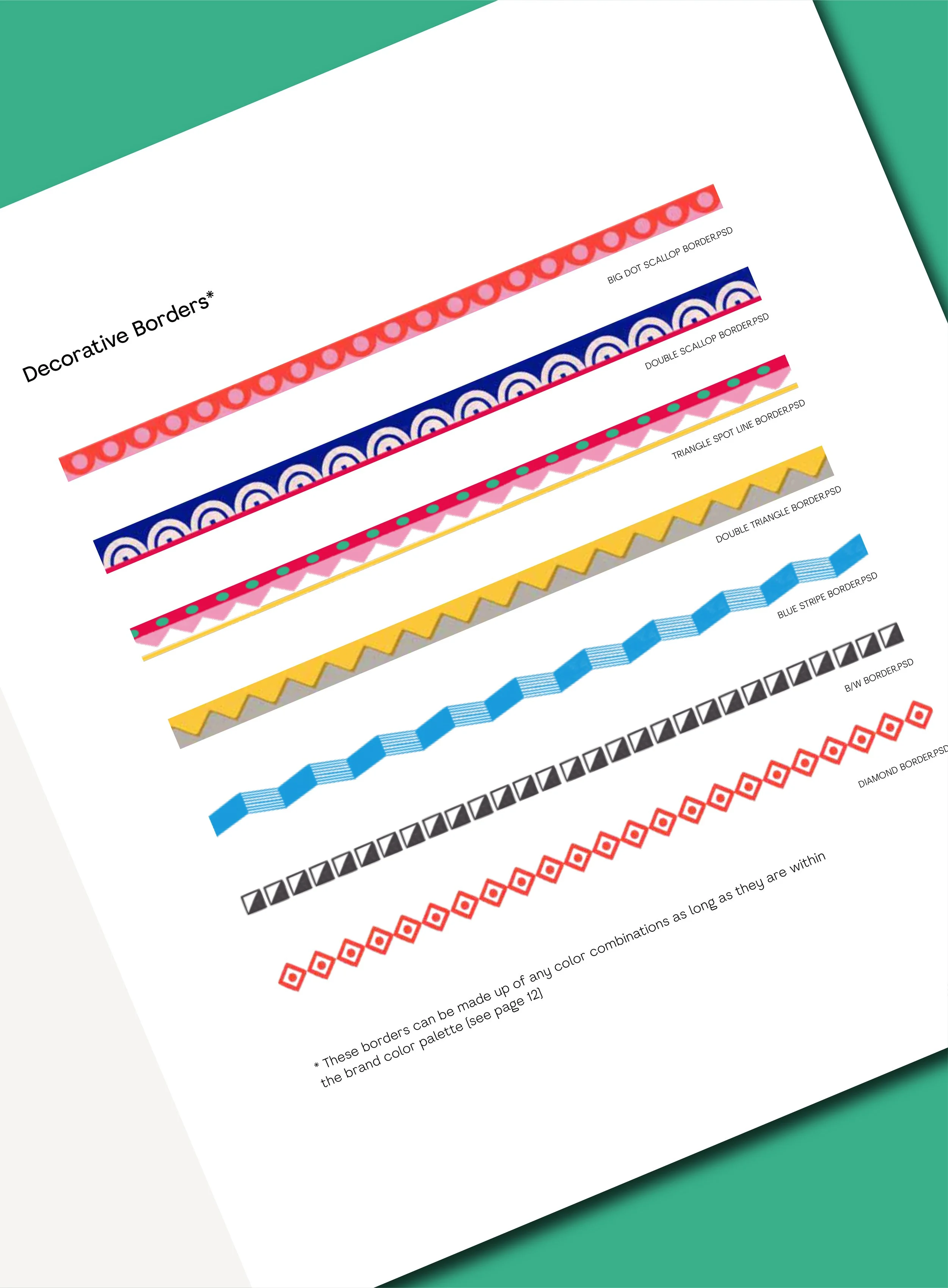
As well as the new logo lock up we also designed a series of graphic treatment elements such as borders and dingbats that could be used across all marketing platforms.
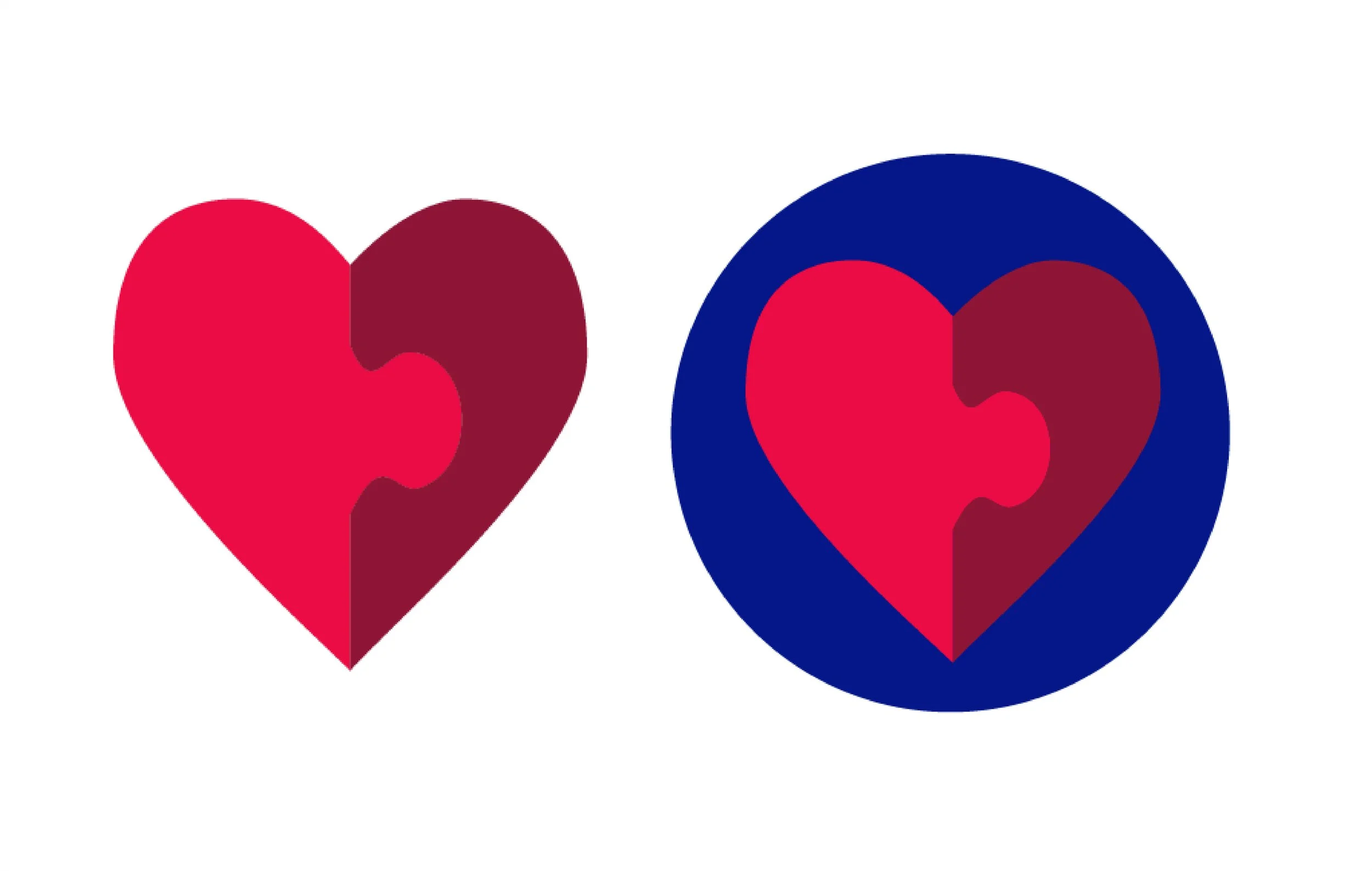
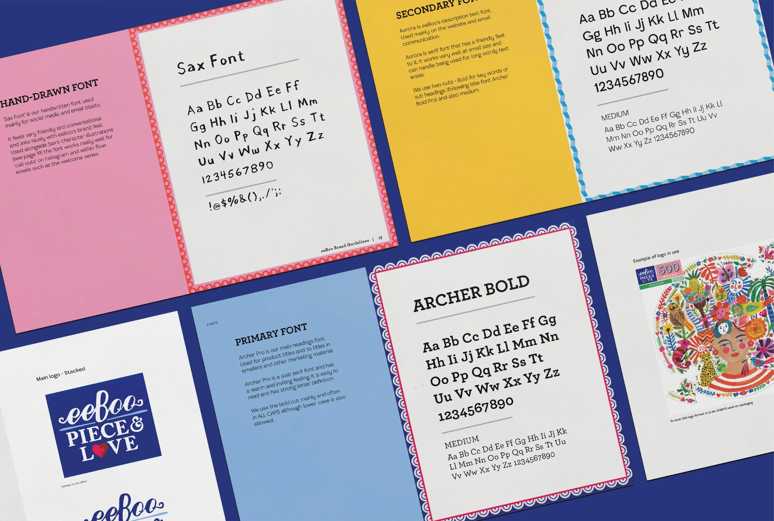
Piece & Love is eeBoo’s sister Puzzle brand. It was important that both logos spoke to each other in their style as they are so often found next to each other. Hence the Piece & Love logo has ‘hand drawn’ feel like eeBoo. The Piece & Love text sits next to a decorative ampersand that again speaks to the eeBoo flourishes. The iconic heart provides the perfect backdrop to the ampersand with the curl on the end nestling.
These decorative borders were created with heavy influence from folk art, textiles and art history. Many eeBoo and Piece & Love products feature detailed beautiful borders which is why they have carried on through to our brand assets.
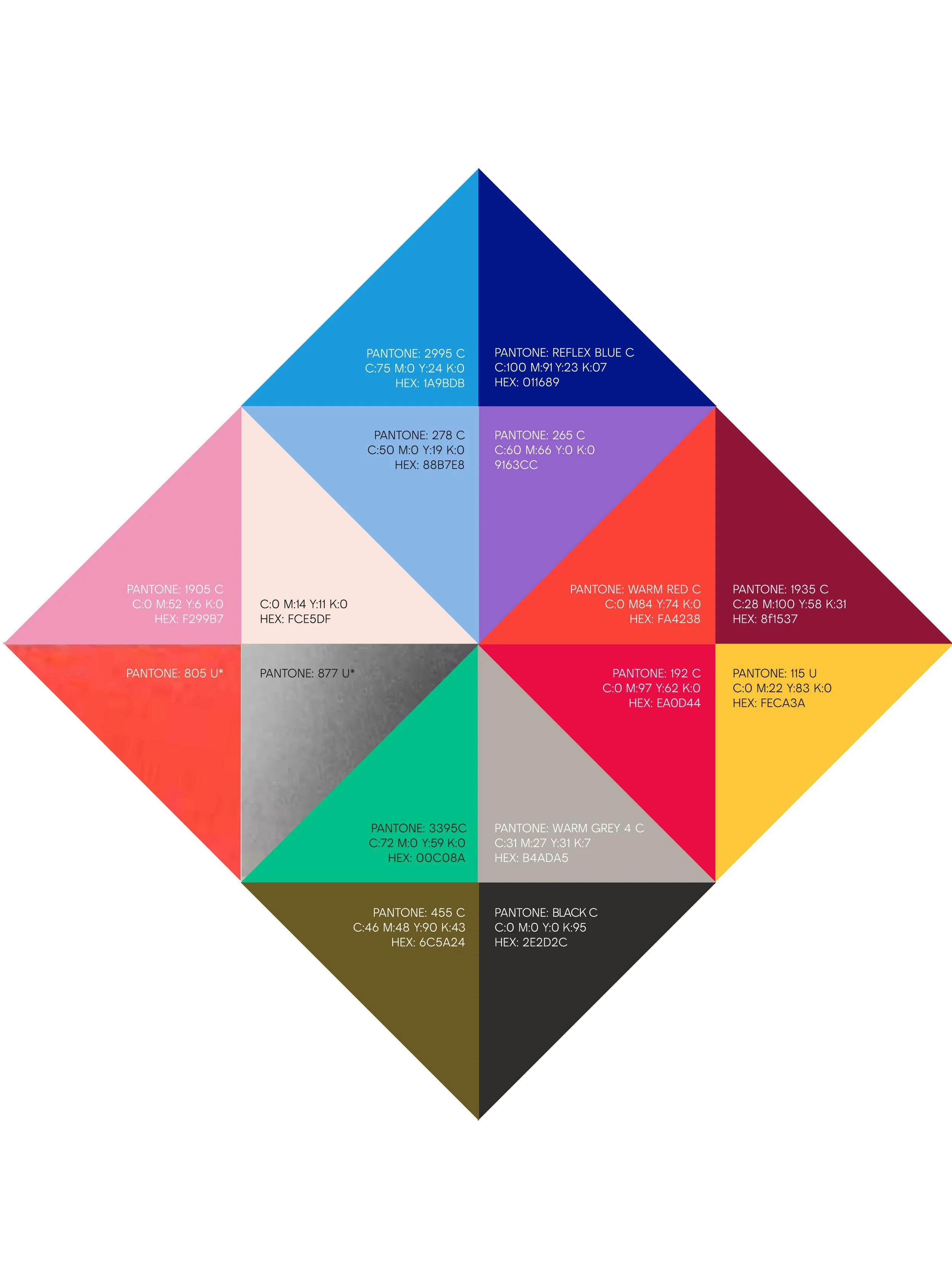
The colour palette was carefully curated hand in hand with the brand owner Mia. We wanted to achieve the perfect mix of light, dark, fluorescent and metallic shades.
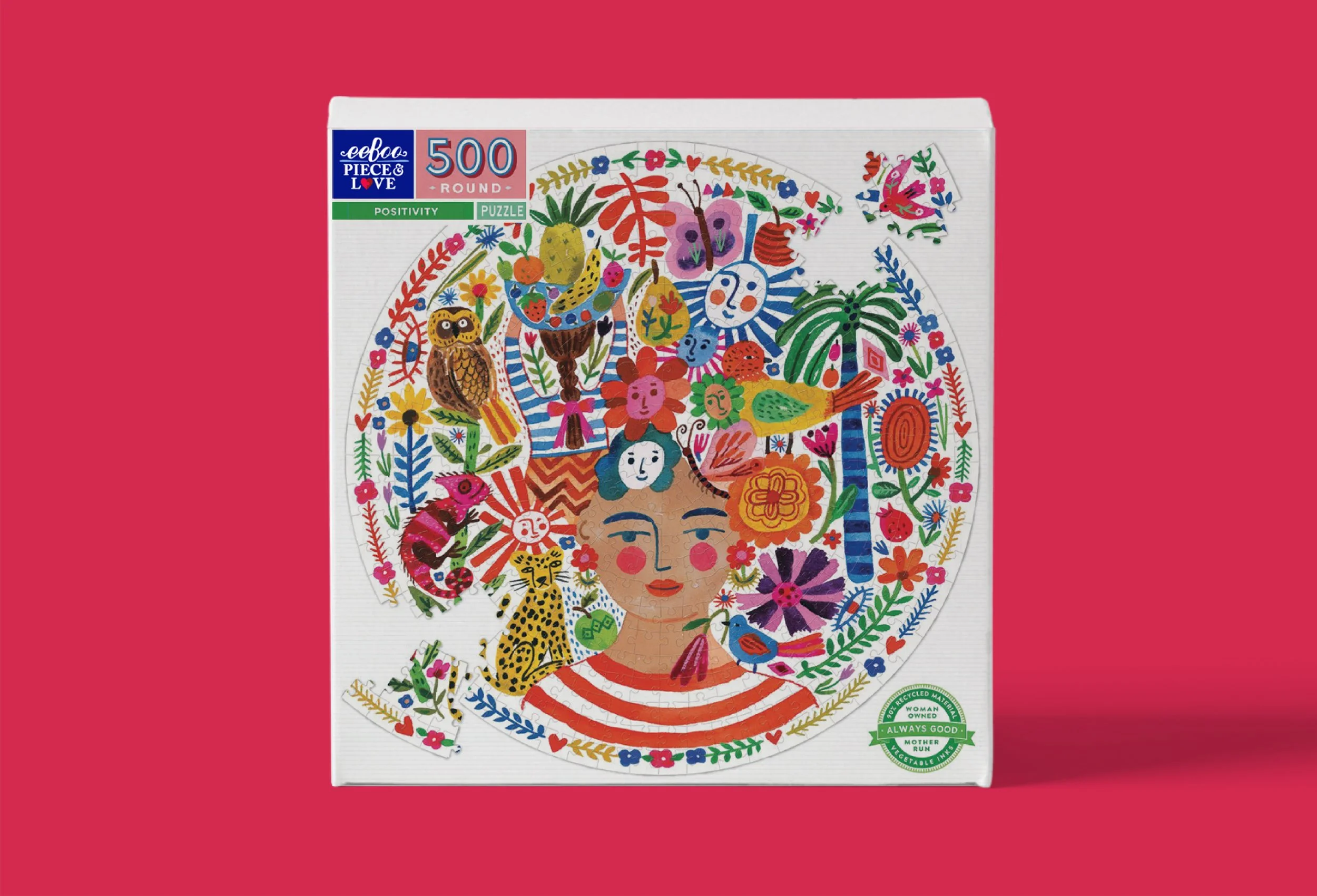
The result is a vintage inspired brand identity that reflects the personality of the eeBoo brand, complete with supporting visual assets and guides on how to implement across product, packaging and digital platforms.

