Kidoki
Packaging design for a brand that encourages personality, imagination, motor and coordination skills through play.
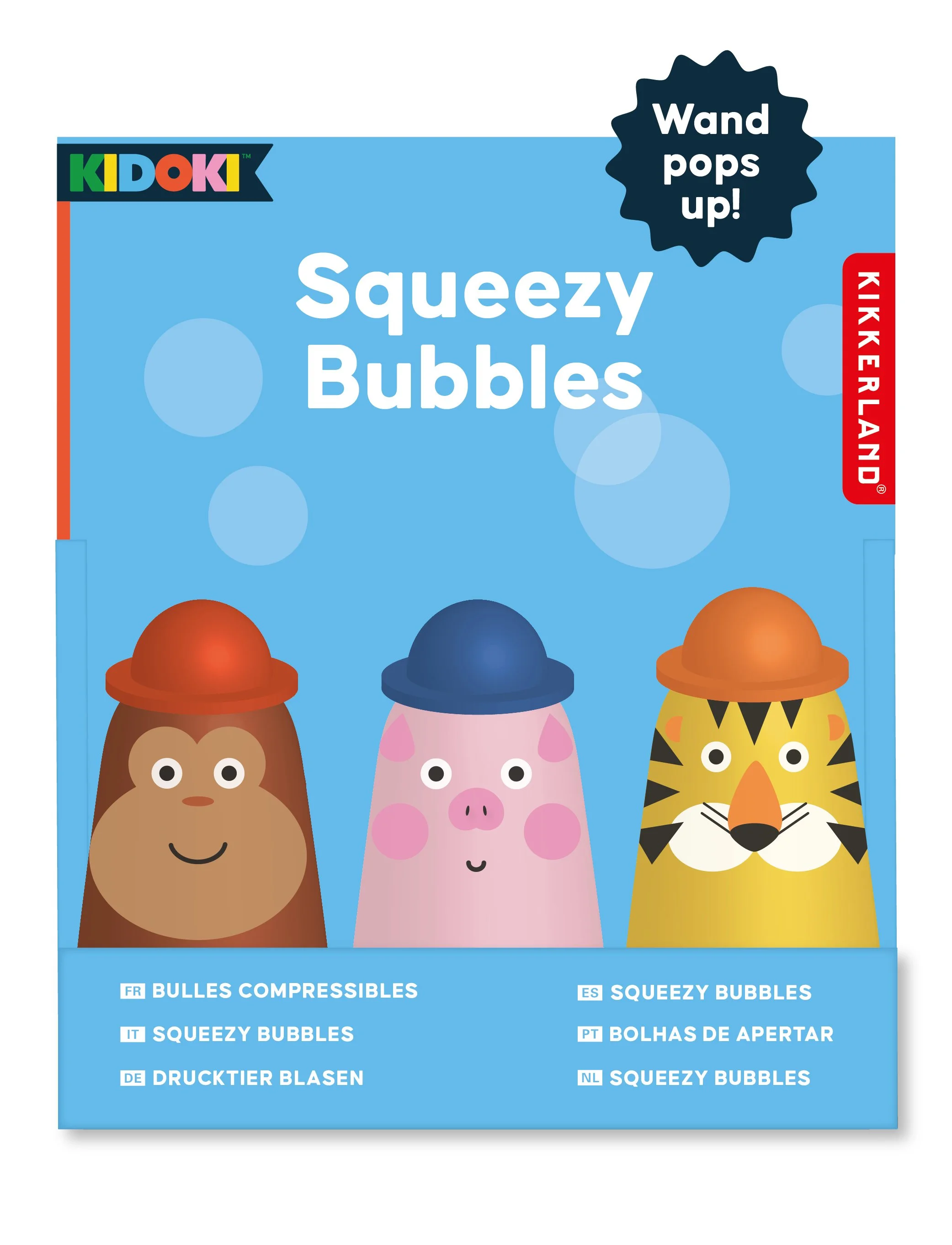
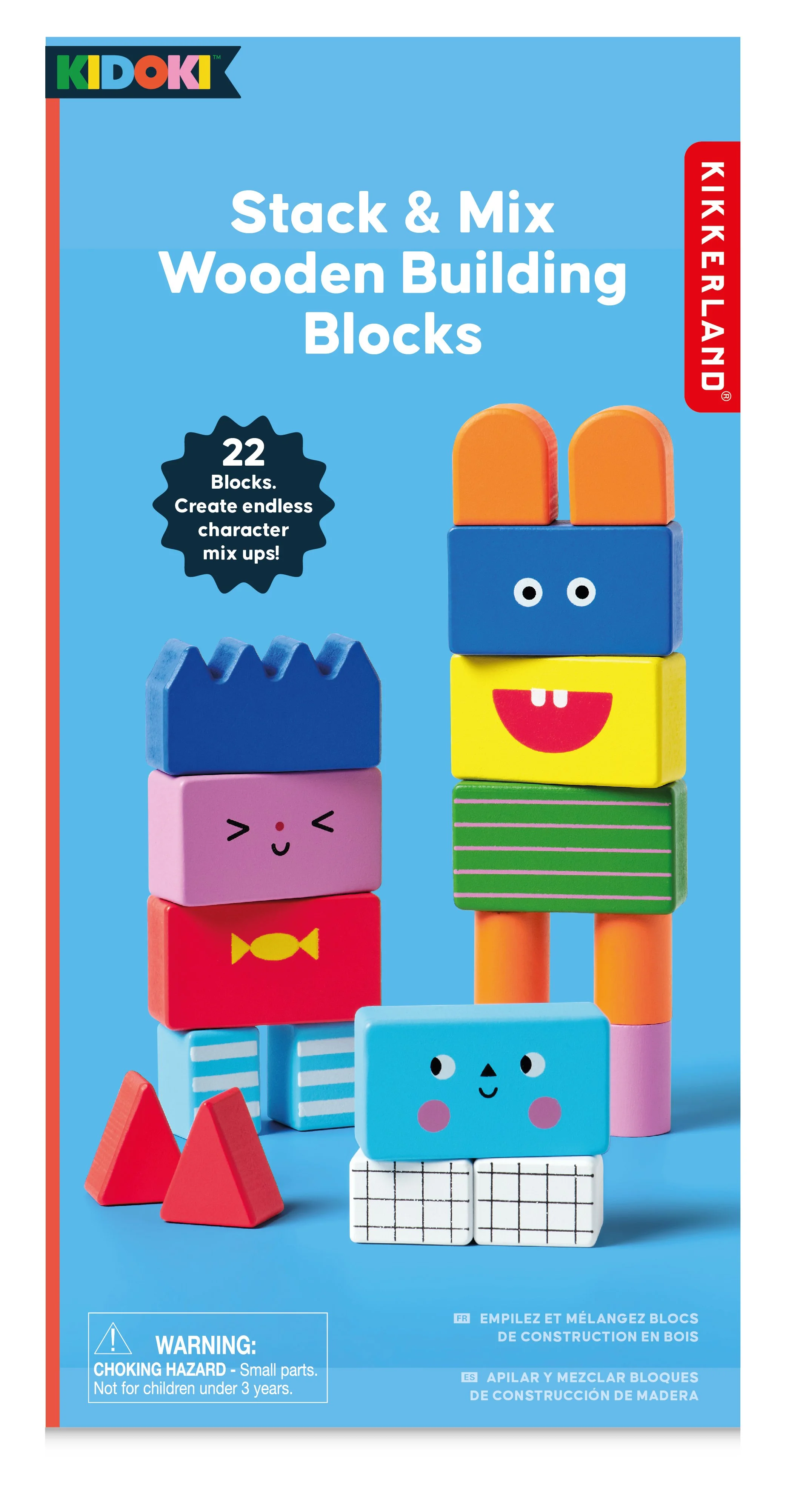
Alongside the products, Goodlines were briefed to design the packaging design for Kidoki products. Through the right balance of colour and graphic elements, the result is a bold, contemporary range of packaging that stands out on shelf.
Goodlines were briefed to design the packaging for Kidoki products. Through the right balance of colour and graphic elements, the result is a bold, contemporary range of packaging that stands out on shelf.
All Kidoki packaging allows the product to sing, either through strong illustrative characterful graphic communication or high resolution product photography in the Kidoki aesthetic with bright bright colourful backgrounds.
The Kidoki brand holds are large bank of colourful patterns and assets (a style guide also created by Goodlines) that can be used across packaging, underneath the product name on the side of packs. This keeps the packaging fresh and playful - just like the Kidoki brand.
Kidoki’s playful characters really come alive in the die-cut shaped packaging we designed for the bouncy balls. With a strong relationship between packaging and product.


