Wildwares
Packaging design for an affordable collection of everyday kitchen essentials with a highly desirable contemporary visual language.
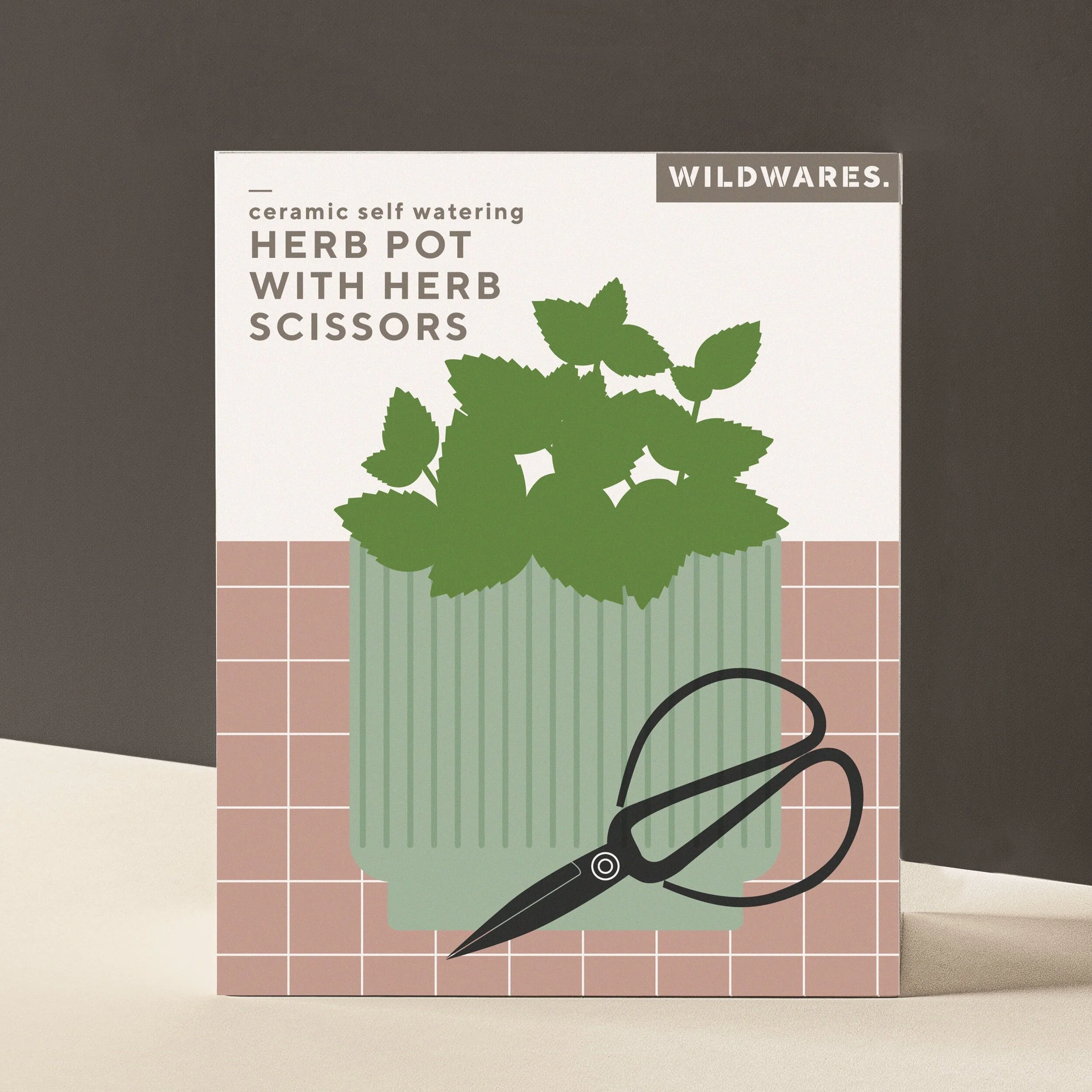
The Wildwares packaging featured a soft muted colour palette with supporting dark blue and warm greys. Each packaging solution has clear product titles alongside strong pictorial representation of the product inside.
Alongside the harmonious colour palette, icons were created to show the key selling features of each product clearly at point of purchase.
A simple grid pattern was used throughout all the product packaging to provide structured backdrop for the illustrations to sit on. It also acted as a common thread to tie all the packaging together.
Illustrations were cleverly used, often linking into the actual product itself. For example, the smoothie straws where one actual straw joined up with the straw on the packaging as well as having a ‘glass shaped’ die-cut window that clearly showed the product.


