W+W for REI
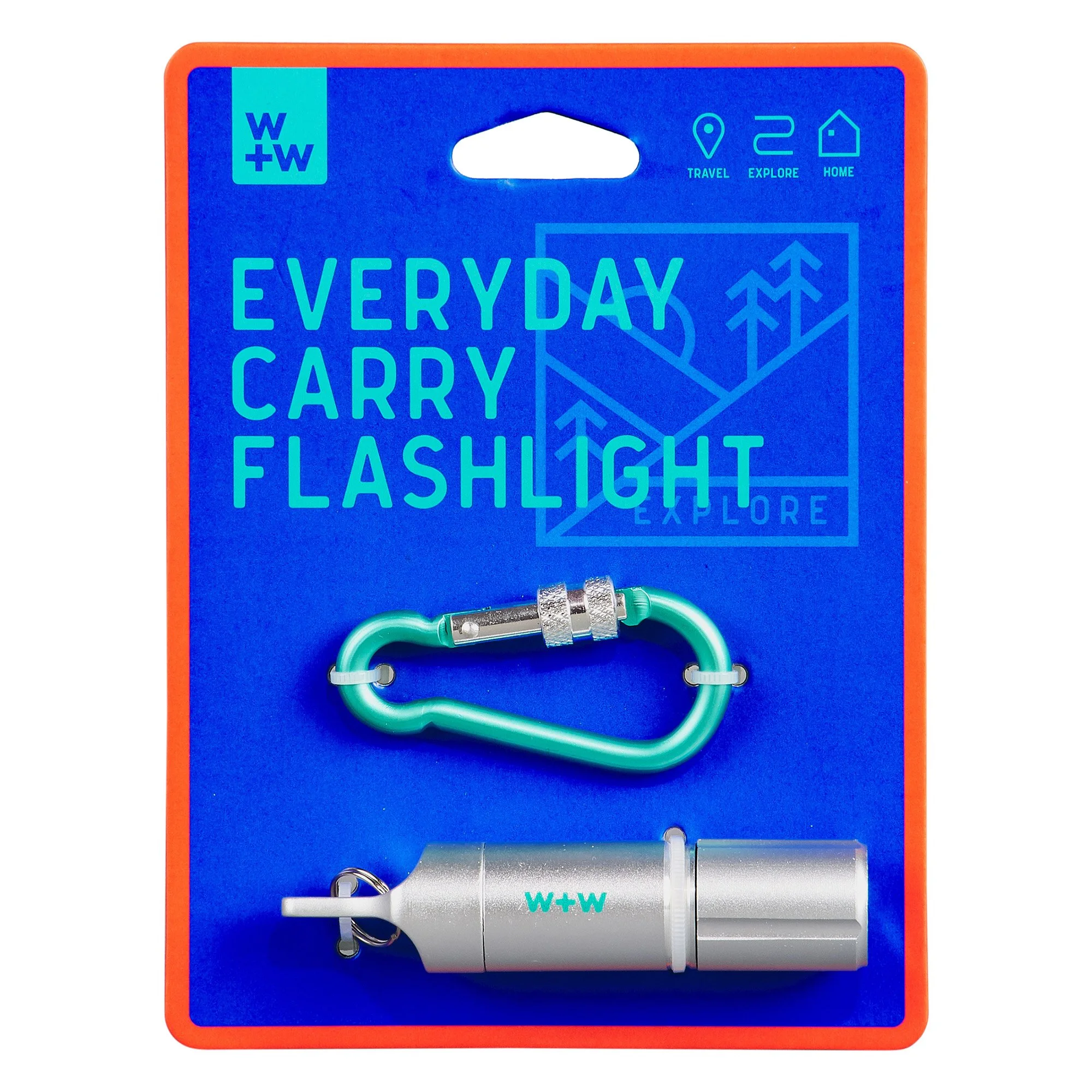
Packaging design for an outdoors lifestyle brand created for REI, designed to be accessible to all, modern and playful.
Our approach to this collaboration was to ensure that we developed a modern brand that was both playful and practical in its design. Featuring large clear product titles, clear infographics calling out product features and a vibrant colour palette, the packaging solutions had real retail functionality in mind.
We created several illustrative ‘badge-type’ icons that depicted different outdoor scenes, forest, mountain and sea. These were featured in all the packaging as a common thread to unite the products together.
The backing cards have multiple uses of iconography. The top left showing where the product can be used, and the bottom left showing three top attributes of the product. Having these on the front of the packaging in both type and icon allowed them to be clearly visual at point of purchase.
The packaging identity was carried through to this in-store display unit that housed all the products in a clear and accessible way with both hanging and shelf storage.


