Kidoki
Logo and visual identity for a new kids brand that is creative, clever and encourages personality through play!
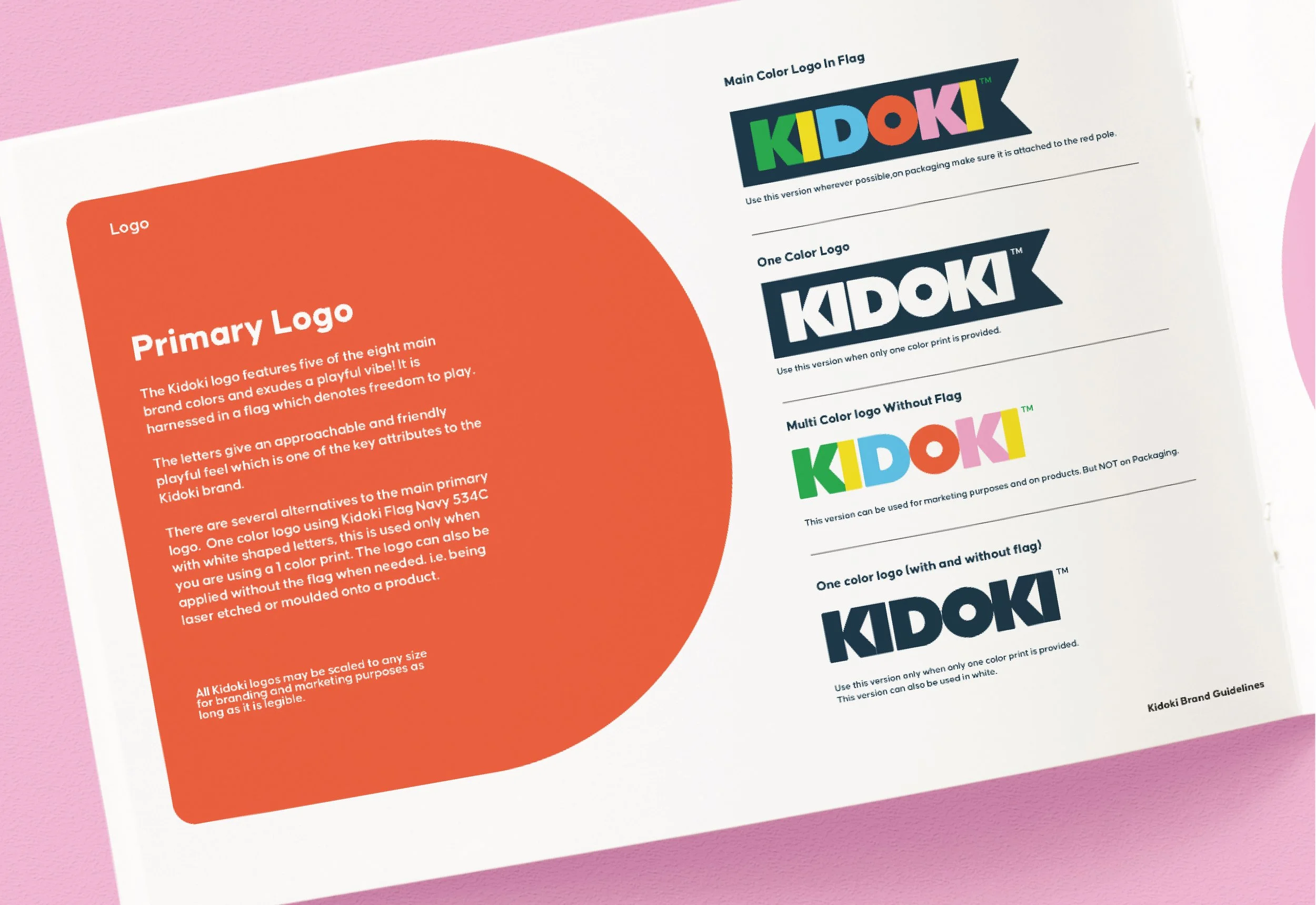
Goodlines created the whole Kidoki brand from naming & logo, through to product & packaging. We compiled all the designed elements into a visual identity document that can be used as a guide to ensure that Kidoki stays ‘on brand’ within all major brand touch points.
Bold and colourful the identity system visually encapsulates all of Kidoki’s core values; playful, clever, functional, and tactile. The style guide is cohesively designed into a set of guidelines for creatives to follow across product and packaging as the brand evolves.
Inspired by the K’s in Kikkerland, the Kidoki logo features five of the eight main brand colours and exudes a playful vibe. It is harnessed in a flag which denotes freedom to play, and further echoes the shape of the K. The rounded shaped letters were inspired by children’s building blocks, which give an approachable and friendly feel. The result is a logo that is vibrant, clever, and encompasses Kidoki’s brand values: all about play!
Colour references are provided in Pantone, CMYK, and screen references so that they stay consistent wherever they are used.
From boxes, to smaller labels to point of sale marketing units, detailed packaging guidelines were established to ensure each and every element stays on brand. This can be picked up by anyone new working on Kidoki collection.


